Notification Redesign
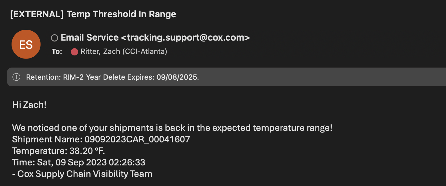
Notifications were one of the original release's for Cox's asset tracking platform. We utilized a tried and true method: plain text emails. Emails were sent every time a specific condition was met, usually whenever an asset exceeded a specific temperature or entered a specified geofence. This covered somewhere in the range of 80% of use cases for almost no effort.
The very first version looked something like this. Admittedly a bit ugly, with a slightly confusing information architecture, but it was out the door in a day not weeks.
The Challenge
Plain emails weren't a permanent solution, but it worked longer than I ever expected. The first customers had pretty straight forward use cases such as basic temperature monitoring - easily served by emails.
As BLE trackers got cheaper, it made sense to track more (and less expensive) things, leading to a pivot from pure in-transit asset tracking to inventory management. This quickly broke things For example, food cold-chain use cases generate about 12 notifications triggers a day per asset. Imagine being a user with 100 assets (not that many) that's a lot of emails!
Some priorities at the onset of the rework:
- Reduce the noise from too many notifications
- Surface the most important assets to a user
- Make it fast and easy for all users to access notifications
- Allow customers to manage their assets in one application
A Note on Density in Professional Tools
You've made it this far. So now you get to hear my piece on information density in modern interfaces, especially professional-grade tools. UI patterns from consumer products leak into professional-grade tools, greatly reducing an applications information density. If you ever get to step foot in a logistics facility, take a look at the amount of people doing their job on one screen.
We need to trust that professionals can handle a complex and dense UI. Unlike consumer-grade applications, professionals are usually signing contracts for extended period of time. It is ok to lean into that and expect users to learn the tool!
I'll probably write an essay about this someday. For now, a designer I take a ton of inspiration from, Neil Panchal, does great summarization of my thoughts: Dear JetBrains. Don't mess with your UI.
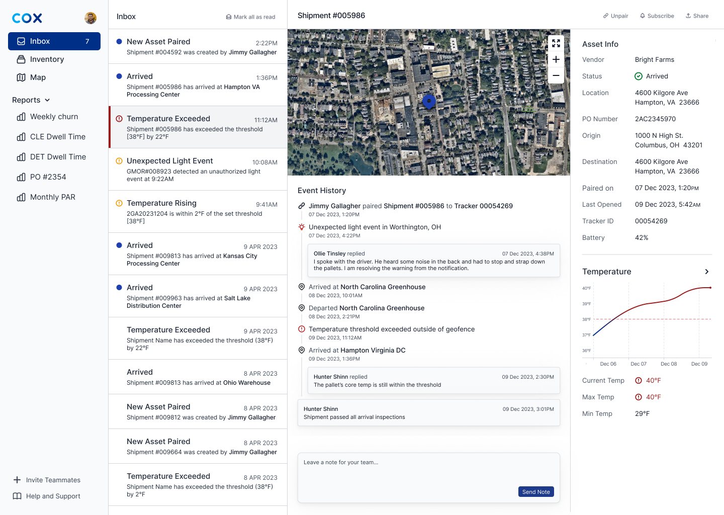
From Email to Inbox
The Inbox was the first major product evolution. It massively changed the product vision, from a simple asset tracking platform, to ambitions of becoming a logisitcs Bloomberg Terminal. We realized that so many of our users are dancing between multiple applications, emails, and phone calls. Being able to view shipment statuses and resolve alerts in one spot seemed like magic.
Future Considerations
Along the way we had a few ideas that we might come back to later:
- Automatic subscriptions: Imagine you're a field engineer and you are looking for assets relating to the project you lead. The field engineer could make a rule that automatically subscribes them to all assets with a specific Project Code.
- Messaging/comments: We noticed that our notifications quickly get shared amongst users, usually through email (sometimes a phone call depending on industry). I have a suspicion that allowing users to add comment history directly to an asset would layer on nicely to notifications, making the app stickier, and allow the user to do everything they need in one place
- Complex multi-condition rules: We nixed this from the start due to complexity (days, not weeks). But imagine a rule where the customer could receive alerts from an asset inside a specified geofence AND when the temperature rises above a specified threshold. This is likely coming soon!
- Filter notifications: Lower priority for now, but it might be nice to filter notifications especially if a user receives a high volume.